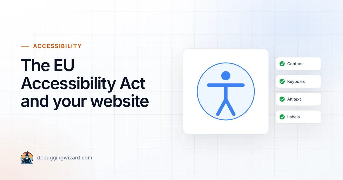
The European Accessibility Act: What It Means for Your Website
Since June 2025, many businesses selling online to EU consumers must have accessible websites. Who is covered, what “accessible” means and a…
Read article
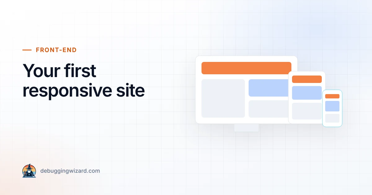
One of the most important skills for beginner front-end developers is learning how to build responsive websites, pages that look great on desktop, tablet, and mobile without needing separate designs for each. In today’s mobile-first world, this isn’t optional, it’s essential.
If you’re building your first responsive website, here’s a step-by-step guide with best practices and examples to get you started.
A responsive website adapts its layout to different screen sizes. For example:
Every good website begins with clean HTML. Keep it simple and semantic:
<header> <nav> <a href="#">Home</a> <a href="#">About</a> <a href="#">Contact</a> </nav> </header> <main> <section> <h1>Welcome to My Website</h1> <p>This is my first responsive site!</p> </section> </main> <footer> <p>© 2025 My Website</p> </footer>
Best Practice: Use proper tags (header, main, footer, section) so screen readers and search engines can easily understand your site.
Instead of fixed widths (like px), use percentages or relative units (em, rem, vw).
👉 Example:
body { font-family: Arial, sans-serif; margin: 0; padding: 0; } main { width: 90%; /* fluid layout */ max-width: 1200px; margin: auto; }
Best Practice: A fluid layout naturally adapts to different screen sizes.
Media queries are the heart of responsive design. They let you adjust styles for different screen sizes.
👉 Example:
/* Default (mobile-first) */ nav a { display: block; padding: 10px; } /* For tablets and above */ @media (min-width: 768px) { nav a { display: inline-block; padding: 15px; } } /* For desktops and above */ @media (min-width: 1024px) { main { display: flex; justify-content: space-between; } }
Best Practice: Always code mobile-first (start small, then scale up).
Nothing breaks a layout faster than oversized images. Add this simple CSS rule:
Best Practice: Use modern image formats like WebP for faster loading.
Don’t just build on your laptop, test your site on:
Your first responsive website doesn’t need to be complex. By focusing on semantic HTML, fluid layouts, media queries, and responsive images, you can build sites that look good everywhere.
The key is to start simple and iterate. Once you’ve mastered the basics, you can explore advanced tools like Flexbox, CSS Grid, and frameworks like Tailwind CSS or Bootstrap to speed up your workflow.
Remember: design for mobile first, then expand to larger screens. Do this, and you’ll always deliver a smooth user experience.
Founder & Lead Engineer at Debugging Wizard. Writes about web development, email engineering and keeping business tech running smoothly.
Since June 2025, many businesses selling online to EU consumers must have accessible websites. Who is covered, what “accessible” means and a…
Read articleSo, you want to become a front-end developer? Great choice! Front-end development is one of the most exciting and in-demand fields in tech right…
Read articleIf you’re just starting out in front-end development, you’ve probably heard these three terms thrown around a lot: HTML, CSS, and JavaScript.…
Read articleTell us what’s slowing you down, we’ll reply within one business day with a clear plan.